
Woop Comunicação is a full-service integrated marketing agency in Brazil with more than 50 professionals.
Over 15 years they have partnered with billion-dollar companies across logistics, consumer goods, construction, and tech, and after a full rebrand in 2024 they needed a website that matched who they had become.
Woop's hardest problem was translating how they work for people outside the agency.
Everyone internally understood their abstract methodology (integrated intelligence, innovation, strategic thinking), while prospective clients couldn't tell what Woop did, how they worked, or why any of it justified the price. There was also no about page, no careers section to attract talent, and no service architecture.
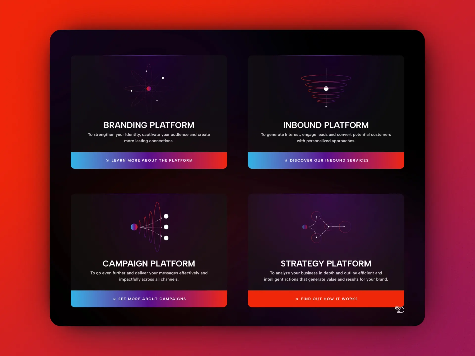
Before I drew a single icon for Woop, I set one rule: NO icon could literally represent its concept.
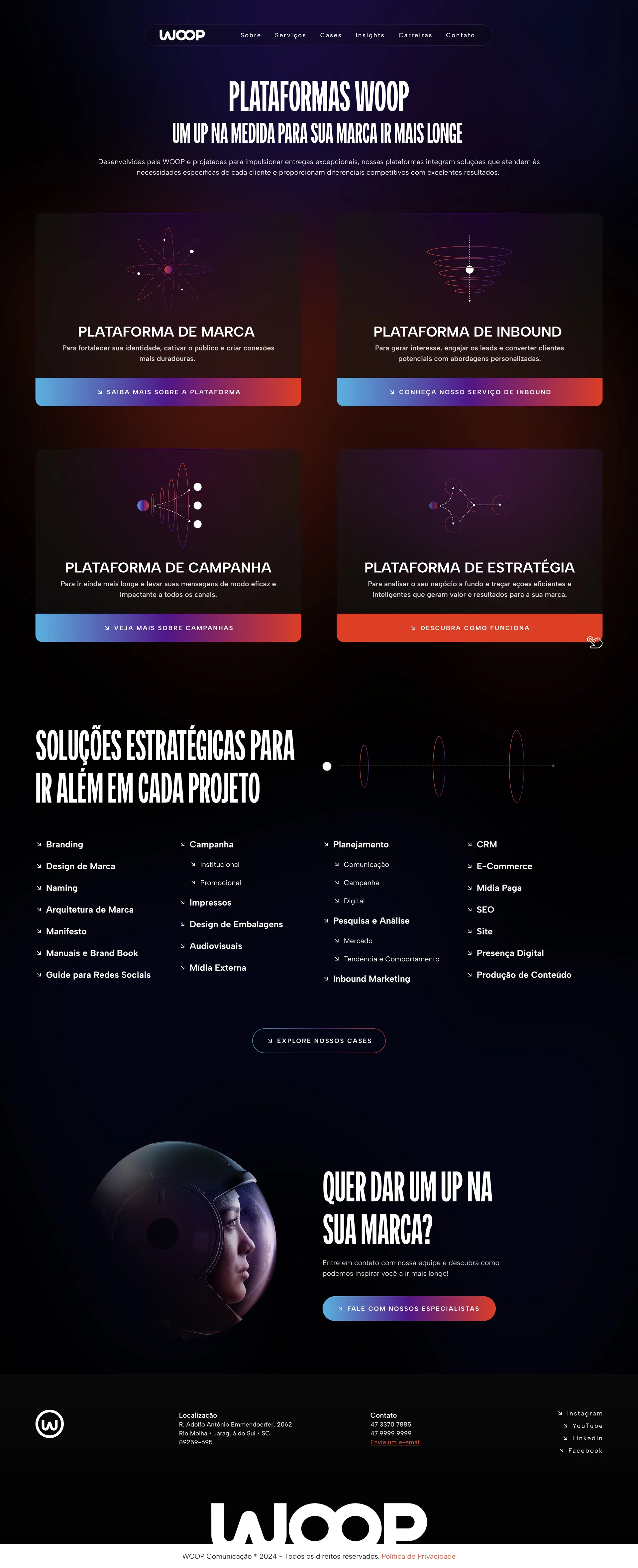
No pen-and-paper for research, and no lightbulb for innovation. Abstract pillars usually die buried in bullet points or flattened into generic icons, so the rule pushed the illustrations into a system: an orbital iconography built from the visual language of the new brand, where every icon works as a metaphor and still reads at a glance.
I was the sole designer, owning UX and visual design from scratch. The copy came from Woop's team, and instead of rewriting the methodology in plainer language, I kept their words and fixed the hierarchy so the site still sounded like Woop and worked as a clear sales argument.
The client expected something conventional and questioned the icons early. Should I soften the system, or explain it? I walked them through it element by element with the reasoning behind each choice (a rule set before the first sketch is a lot easier to defend than taste)... which meant slower rounds and harder conversations. Only two of them, though.
The site launched in 2024 and is still live largely as designed.
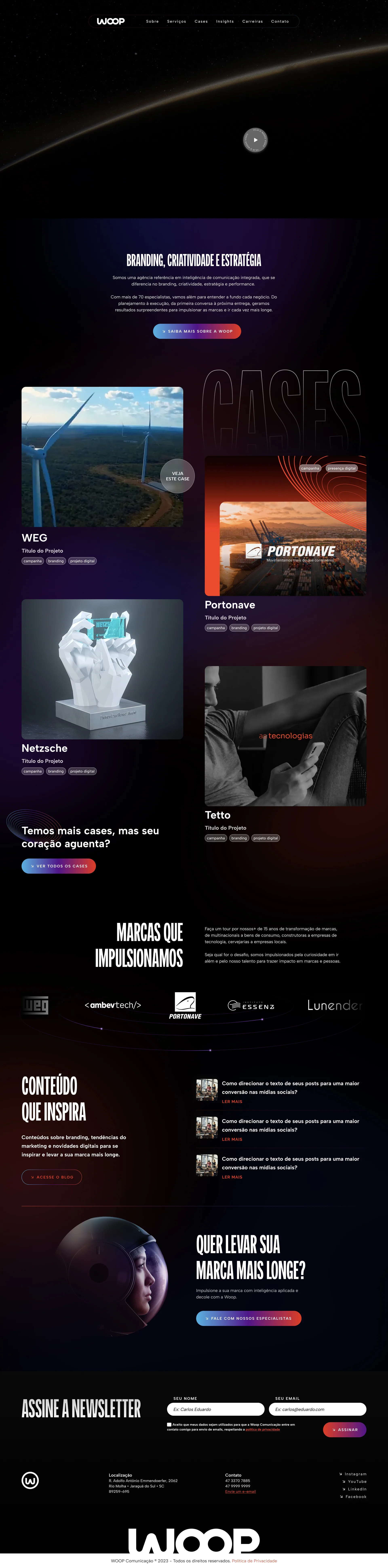
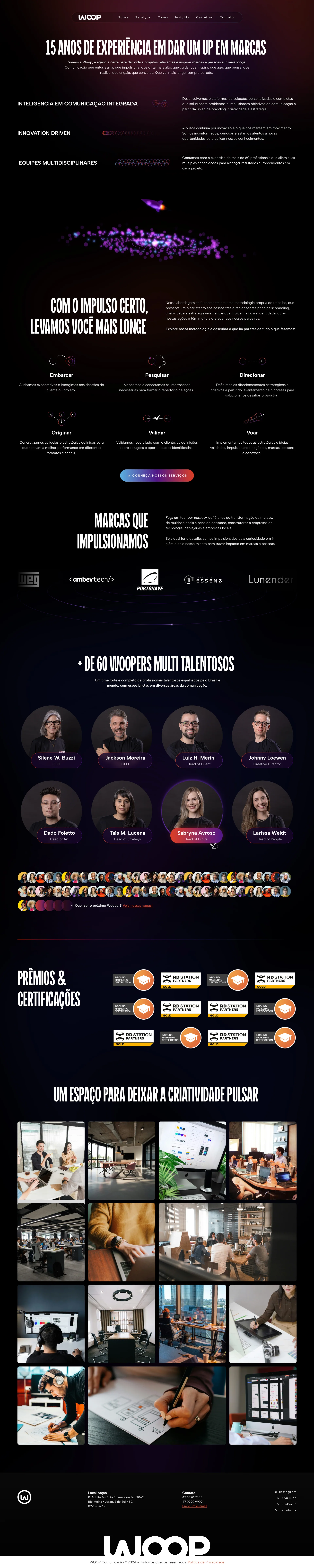
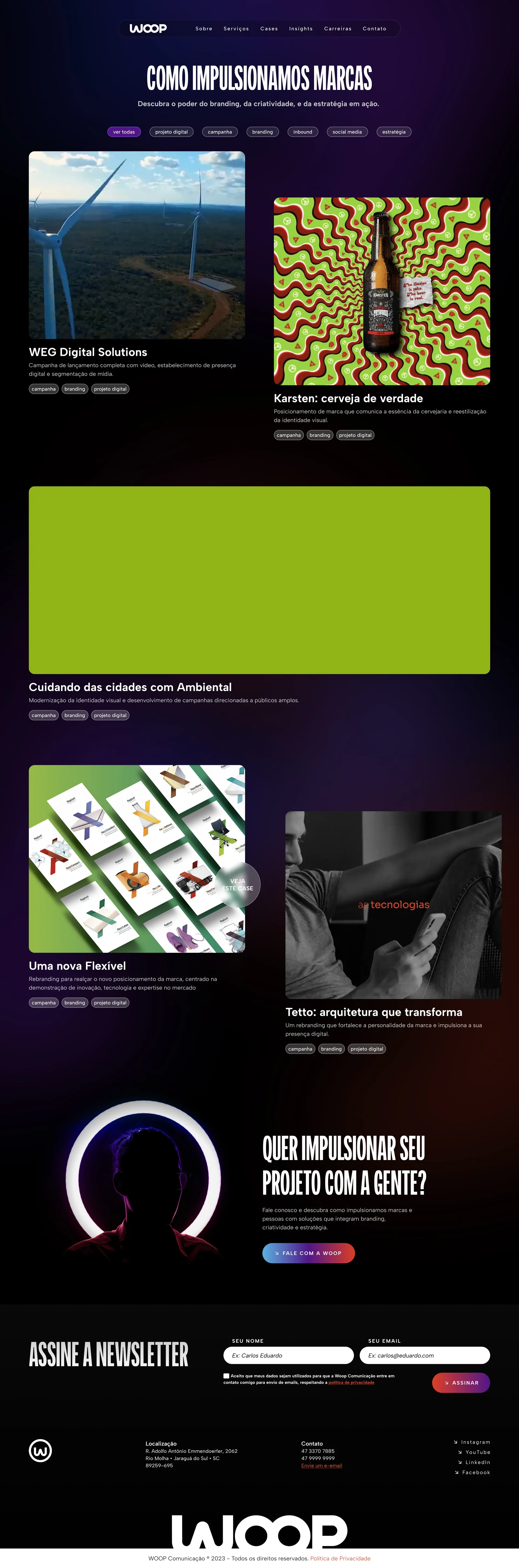
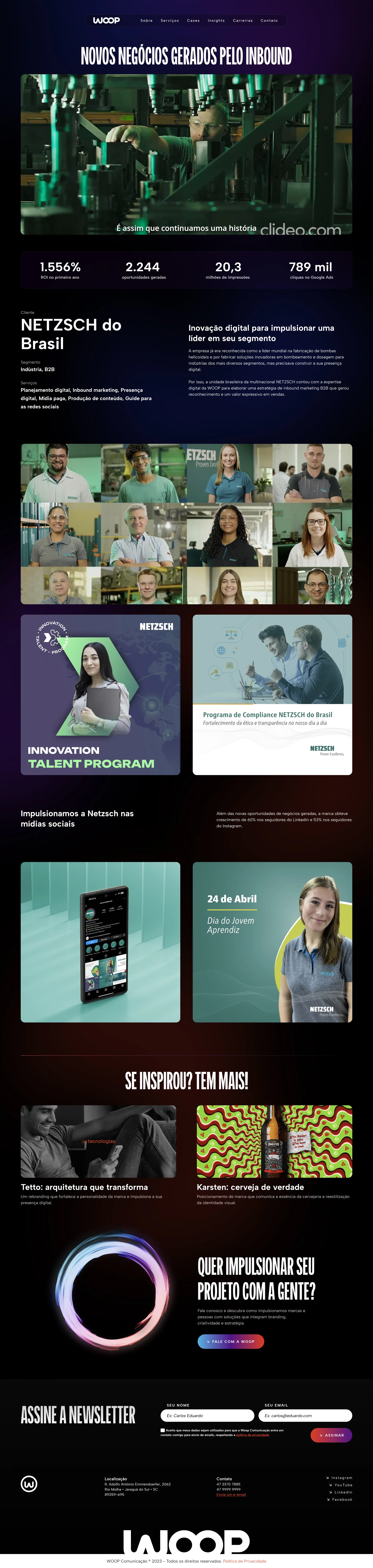
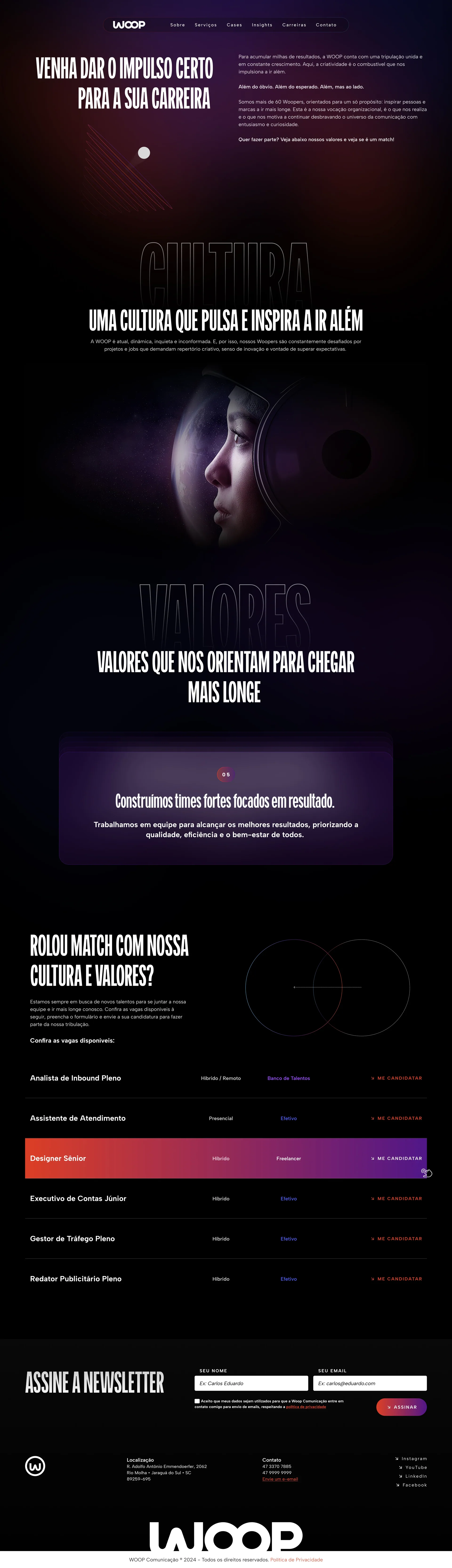
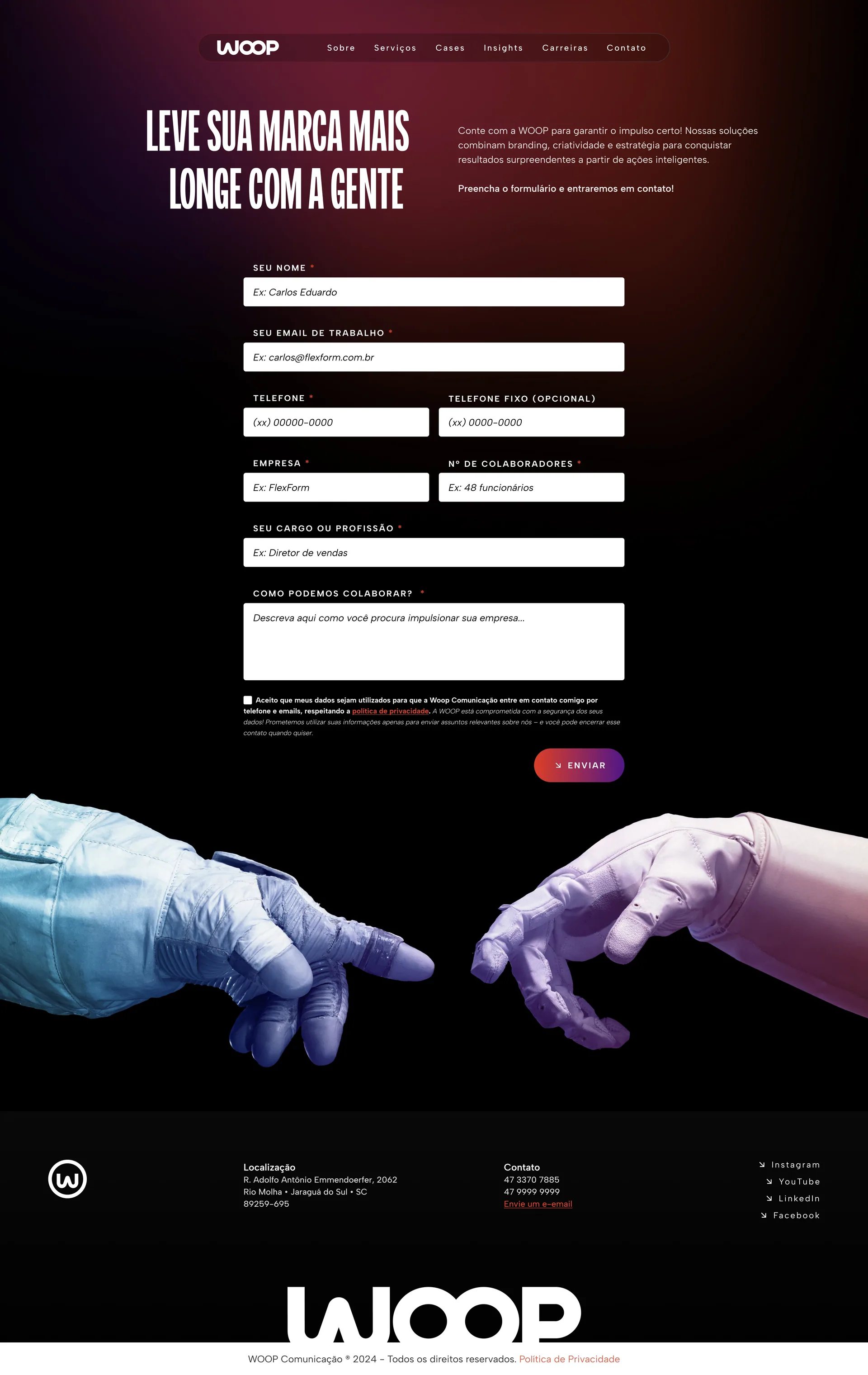
Seven-plus pages shipped, including an about page, case studies, careers, and a services architecture the agency had never had.
No hard metrics were disclosed. What I have is direct feedback: several clients said the site raised their perception of Woop's credibility and professionalism.